As the previous post about colors in charts and a poll might have suggested I am quite a big fan of Perceptual Edge when it comes to charts and colors in dashboards and other displays. This here is a quick hands-on tutorial how to create a Perceptual Edge style bar chart in Cognos Report studio. Something that looks like this:
The chart is displaying sales by country (ordered highest to lowest) and comparing that to budget; if sales are below budget the red bar is added to illustrate how much there should have been (as for Switzerland, Germany and Italy in the above); if sales are above budget a gray dash is displayed in the position of budget value (as for France and Spain in the above).
So, the first thing we need is a query. Pick the Sales and Budget measures. In addition manualy create these items:
In this case Country is just a manualy created set out of members in country hierarchy. Contents of budget measures are as follows.
Left to budget:
IF ( [Sales] - [Budget] < 0 ) THEN
( [Budget] - [Sales])
ELSE
( NULL )
Meaning if we are under budget then we create the difference (red piece of the bar) to be added on top of sales.
Fulfilled Budget:
IF ( [Sales] - [Budget] > 0 ) THEN
( [Budget])
ELSE
( NULL )
Meaning if we are above budget then a point will be created, otherwise there will be nothing. The ELSE NULL is what makes gray dash disappear completely if sales are below budget.
Rank is there to order things.
Rank ([Sales] desc within set [Country])
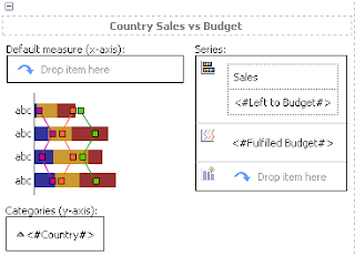
Now it's time to put all of these into a chart:
The Sales and Left to Budget are in one stacked bar chart. The Fullfilled budget is as a line chart with no line displayed and all data points visible and set to Vertical Line 10pt in size.
The palette contains only three colors: Black, Red and Gray.
If you enable tooltips the users can hover over with mouse and see actual values for all items. Also you could display the values though I've found that they are too clumsy to be usefull directly on the chart. Better to have a supporting table if needed...
So, here we are having a nice clean bar chart generated by Cognos! This clean design really helps when working on dashboards which automatically have space limitations. And it kinda looks good too...
Good luck with it!
M.


No comments:
Post a Comment